Sunday, August 16, 2020

The Ten Minute Session: Continuous Line Drawing

Description

Unbroken line (do NOT lift the pencil off the page)

Lines may double up


Instructions

1.     Pick an object that you have to hand; a cup, your phone

2.     Set yourself up with some paper and a pen or pencil

3.     Look at your object carefully, decide where you are going to start your drawing from

4.     Put your pen on the paper – and do not remove it – and follow the shape of your chosen object. You can cross over lines and retrace areas if you need to get your pen to a different spot

Task One

Complete a 30 second continuous line drawing

Task Two

Complete a 2-minute continuous line drawing


Sunday, August 9, 2020

ModRoc!

Since completing the Sculpture Matters workshops hosted by NUA remotely in the last couple of months I have been drawn into exploring my text more sculptural. After the Sculpture Matters workshop I wanted to play with the ModRoc and see how it could work within my art practice.

A ModRoc Cast of a Lid
ModRoc Sculpture Matters Outcome, 2020

This is not something new to my practice, but it is something that has fallen from my practice in the last two years. The last time that I explored more sculptural text was during my MA, at this time I was exploring wooden board and plaster. 
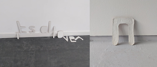

Letters made from wooden board reading 'its all over', letter made from plaster reading 'n'
Wooden and Plaster Letters, 2018

Since Sculpture Matters, I have returned to plaster, but this time in the form of ModRoc. This material is perfect of me at it fits into my DIY art process and aesthetic. It is simple and only requires simple tools and processes to create something from it (Vam, 2017). It is also relatively cheap (Benjamin, 2015).

I have been using this with wire, creating letter frames based on my font ACcomplete4 and then covering them in ModRoc to create the final outcome. The intention is for these to be installed in outside environments and the ModRoc comes with the bonus of bring white, allowing for it to stand out from the background making it easy to read from a far.
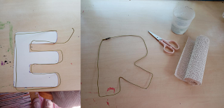

Letters made from wire, letters E and R
Wire Letter Frames, 2020

I do not want to paint or ‘finish’ the ModRoc lettering as I want them to retain their DIY-ness and imperfections. The finish is not even the biggest imperfection with these, I found that during the process of adding the strips to the wire frame the letters became a little distorted from the weight of the ModRoc and from the handling, meaning that they are not perfect representations of the font they are based upon. For my practice this is not an issue as I think it is important that something that is given shape by hand reflects that – if I wanted them identical there are many other processes I could have used. It just adds to each being its own entity, they are 'originals' of sorts (Judovitz, 1998), but also multiples Each has come about by the same process, but this has not been an identical experience (Benjamin, 2015).  
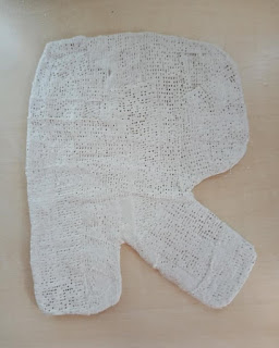
Sculptural lettering made from modroc, letter R
ModRoc R, 2020

In the creation of the letters there is a focus on each as an individual linguistic unit (Katamba and Kerswill, 2009), rather than on a final word or outcome. The intention being that the collection of linguistic units could be put together in many ways to make many words.

A collection of sculptural letters made from ModRoc
ModRoc Letter Collection, 2020
 

Going forward I plan to grow the collection, before playing with the arrangement and installation of them. My initial idea is to have them as something that the public would be able to interact with and move around themselves. 


References 

Benjamin, W. (2015) Illuminations. London: Penguin.

Judovitz, D. (1998) Unpacking Duchamp: Art in Transit. University of California Press.

Katamba, F. and Kerswill, P. (2009) English Language: Description, Variation and Context. Palgrave; 2009 edition.

Vam. (2017) Plywood: Material of the Modern World. [online] https://www.vam.ac.uk/exhibitions/plywood-material-of-the-modern-world. [accessed 18/07/20].


Sunday, August 2, 2020

The Ten Minute Session: Automatic Writing

Description

Automatic writing is a Surrealist technique which allows you to free your mind and create free flowing texts. The technique is said to help you access your unconscious mind.

The results of automatic writing are often nonsensical and sometimes illegible.

The instructions below have been adapted from those written by Andre Breton, a Surrealist Artist.


Instructions


1)    Set yourself up with paper and a pen


2)    Put yourself in a passive state


3)    Forget your genius and talents – and everyone else’s


4)    Write quickly without a pre-set subject


5)    Do not read over what you have written


Sunday, July 19, 2020

The Ten Minute Session: Drawing Circles

Description

This activity is designed to help you become one with your pencil. Complete the tasks below in order.


Instructions

        Do not use a compass

        Try to use your whole arm and not just your wrist

        Hold the pencil lightly but move quickly and freely


Task One

  1. Draw 20 circles


Task Two


  1. Draw 5 semi-circles


Task Three


  1. Draw 1 large circle
  2. Fill the large circle with lots of little circles


Sunday, July 12, 2020

The Road Sign Collection: Update

Working on The Road Sign Collection during lockdown has been an interesting experience. 
The project was driven initially by these everyday items that feature in our lives, however since being in lock down they has almost stopped being everyday items - at least for me, as I have not left the house since the start.

This really made the notion of time and place hit home, as the project was not now about 'now-ness', but rather about the past and the things that I use to encounter. I think I have started to romanticise road furniture, how great it would be to see a 'stop' sign again.

The end goal is to turn The Road Sign Collection into a colouring book - and the reason for the Firstsite Collectors Group Bursary - made up of continuous line drawing of the road signs. This perhaps further romanticise them.

The second thing that I noticed is that when totally removed from their original context the text used within the signs is so easily transferable to the situation we find ourselves in. I put this down to the largely institutional and warning language used within signs.

give way
end
danger
danger of death
changed prioritise ahead 

The reading is of these words in this new context are slightly dark and some are more obviously transferable than others, however it is a great example of how mutable language is and how important context and intention is too.

Sunday, July 5, 2020

I learnt a new skill: Exploring Lino

Like many people I took the lock down to learn a new skill, the skills I choice to learn was lino cutting/printing.

Before now I do not think that I had every done lino before, even within my art education I only have vague memories of creating etchings (not for me), but no recollection of lino.

I am not sure what drew me to this new skill set, however I think it probably had something to do with my near-obsession with creating collections and repeats and thought that this would be a good way to do that. It also removes any fears I have about my love of repeats and repeats not being originals. As with the print, while they come from the same stamp, each outcome is original and can vary in so many ways aesthetically. 


The process also feeds into the DIY nature of my practice, as I can make something from my hands to use within my practice. Even the inking up and printing allow me to be fully involved. 


I pick some tips up from attendees to an Online Creative Practitioner Support Programme session before I go started. Other creatives suggested that I warmed up the lino before I got started and suggested that I try to keep all my fingers in tact too. 

I decided to use images and text from The Road Sign Collection within my lino prints as a way of developing that body of work and looking at it in a new way. Until now it had been a digital project. 


The trickiest part of the process has been remembering to flip the images, other than that I found using the cutting tool quite easy to pick up and use without any training. My one tip would be to ensure that you use a marker on the lino once you are sure you have the image correct before you start cutting, as this will not rub off while you are working.


As I continued to play with the lino I decided to also create stamps of my font, ACcomplete4, initially this was a way to use up small off cuts of the lino. However, like with the road signs this will allow me to explore the font away from the computer. 


The aesthetic of these is a little more ransom-note-like than I had hoped, given that the initial intention behind the font was to create a type face which felt friendly and approachable.