Showing posts with label o'doherty. Show all posts

Sunday, October 4, 2020

Borders: Tickets, Please

Tickets, Please, draws it inspiration from the train journey that connects Colchester and Ipswich. The train ticket allows us to cross over the border. It is elevated above what it is, a piece of card and it becomes something that give your access to a service. In a similar way, with this piece I am also elevating a piece of card to something else, a piece of work that exists in the art world.

The work draws on the train ticket as a symbol and hints at the original with the use of replicating the size, shape and lines of an original. I wanted the work to be recognisable but not to be a copy a when working with reproductions something from original is always lost (Benjamin, 2015) and so I wanted to avoid this by taking inspiration and elements, rather than the train ticket as a whole. 

The medium has been chosen to add a DIY quality and uniqueness to the objects, something that their inspiration lacks. As train tickets are mass produced and computer generated. This addas a human element to the aura of the artwork and is fitting to my art practice.

The work itself is sculptural – not 2D. It is intended to exist laying on a surface, preferably the floor – where it seems from experience most train tickets end up (or at least it seems that way!). There are parallels here too to the train station floor and the gallery floor, they are both spaces that are overlooked in everyday life, which is another reoccurring theme in my practice, the Duchampian unchoice territories (O’Doherty, 1986).

There is an intended simplicity here which helps give the audience immediate access to the work (Stiles and Selz, 2012). Just by putting something on the floor, draws attention to it, make it similar to the everyday encounter of the original train ticket and that experience of looking down at it (Virilio, 2010) and helps to replicate a moment from real life. It allows me to try and emulate that immediacy and experience of being in the moment and spotting something (Hayward, 2004).

The text on the tickets is taken from the letter coding used for each location within the context of the railways system.

It uses, as all of my art does, our shared language (Wittgenstein, 2007) and social facts (Burke and Crowley) – in this case social facts specific to train stations (COL instead of Colchester / IPS instead of Ipswich). All language aims at communicating something (Delacroix, 1924 in Ullmann, 1962) and

my use of linguistics within the artwork (both of the text and the title) sets out to communicate notions around train stations, to engage the mind of the viewer and take them to that train station context (Saussure, 2013, p19).
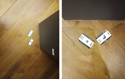

A picture of an art installation
Tickets, Please at Firstsite

The work itself has changed since its inception, in meaning and in placement. I used to travel by train between Colchester and Ipswich three times a week for work – the pandemic ended that, and now I do not even work there and never returned before I left due to home working. This now represents a moment from my past, whereas when it was created it was my present. The work too changed once in situ at Firstsite, with photos showing slight movement in placement, something you come to expect with floor-based works.


References


Benjamin, W. (2015) Illuminations. London: Penguin.

Burke, L. and Crowley, T. (2000) The Routledge language and cultural theory reader. London: Routledge. (The Politics of Language).

Hayward, K. (2004) City Limits: Crime, Consumer Culture and the Urban Experience. Routledge-Cavendish.

O’Doherty, B. (1986) Inside the White Cube. University of California Press.

Saussure, F. (2013) Course in General Linguistics. Duckworth; New edition.

Stiles, K. and Selz, P. (2012) Theories and Documents of Contemporary Art: A Sourcebook of Artists. University of California Press

Ullmann, S. (1962) Semantics: An introduction to the science of meaning. Oxford: Blackwell.

Virilio, P. (2010) Art as Far as The Eye Can See. London: Bloomsbury.

Wittgenstein, L. (2007) Lectures and Conversations on Aesthetics, Psychology and Religious Belief. ed. Cyril Barrett. Berkeley and Los Angeles: University of California Press.


Sunday, February 16, 2020

Artist Research: Everyday Things


When developing new work, it is probably a good idea to examine what has come before. Artist research is one of those areas of my practice which is probably neglected too often. With tight time constraints I often pick playing in the studio over artist research. However, this is when my duel role of artist/teaching is beneficial, as when planning sessions, I will always include artist reference to learners to draw upon. This aspect of planning directly feeds into my own art practice, as I will inevitably be inspired by, or see connection to my own practice in some of the artists I present to my learners.

Recently I was looking for examples of artists who created several outcomes based on the same object for a session which focused on still life drawing. I had not noticed at the time, but by searching within these terms I was already drawing parallels to my own practice, as I am essentially look at artists who are creating collections of the same type of thing – for me that thing is road signs. For the artists I researched that type of thing varies. However, what does stay the same is that the artists are often looking at things that fall into the notion of the everyday.

This pull of the everyday as inspiration within art may come from the lure of having the power to help it escape the commonplace, by manipulating the subject matter, controlling it within an art context or simply letting it surrender to the free-play of our subjectivity (Vaneigem, 1983). Whatever it is, the everyday is as popular now as an art subject as it ever has been.

The first artist falls into the latter category, as I have enjoyed the work of Michael Craig-Martin for as long as I can remember. Initially this was due to An Oak Tree, 1973 which as an artwork holds conceptual thinking processes at its centre (Manchester, 2002), conceptual art plays a huge part in my practice.

Craig-Martin, An Oak Tree, 1973
However, more recently I looked to Craig-Martin in reference to his drawing and sculptures. Within my art teaching we look at his works in relation to line drawing techniques, to illustrate how drawings do not have to exist on the page but can also exist sculpturally.

His recent exhibition, The Shape of Things (2019b), echoes my linguistic preference – this is in preference to the word ‘object’ mostly, as object/art objects/everyday objects come with a lot of baggage. Thing feels relatively baggage free. The exhibition sees six steel sculptures installed outside around the Kinder Lake in Houston (Craig-Martin, 2019b). What is evident in these works and the others like them is firstly the simplicity and the power of a strong line to convey information about things. But also, the use of increased scale. The work perhaps slips into notions of the uncanny, by taking these familiar things and changing them in such a way that they start to feel strange (Freud, 1919).

Craig-Martin, Sculpture, 2019a

His things of choice; paperclips, scissors, bottle openers, umbrellas are usually overlooked, very everyday and probably unchoice (O’Doherty, 1986) as subject matter to most. These three categories, I feel are shared with The Road Sign Collection. They are both over looked in the same way, as we use paperclips and road signs functionally, but they are overlooked in other ways. They are very much a means to an end. By using these and increasing the scale Craig-Martin can make the viewer look again (Sedation, 2019). Not only at these supersized versions, but also at the originals, helping to emphasis the significance of these things in our everyday lives. Playing with scale is still on my to-do list and is something that I very much want to explore. Particularly, when seeing how successful the outcomes can be when done well.

The move into sculpture is possibly where the similarities end between me and Craig-Martin. It is not something that I have considered playing with, my main worry is that they would become copies of the original signs, which are in themselves (functional) sculptures. The change in scale would have to be significant to make my outcomes different enough, original enough.

Patrick Caulfield’s work was new to me, (and they actually reminded me of Craig-Martins painting when I first saw them – though his clearly have come before Craig-Martin, you do not always discover things in chronological order).

Craig-Martin, Untitled, 2016 / Caulfield, Wine Glasses, 1969
A quick search of Caulfield and you will see many outcomes which focus on ordinary everyday things, such as wine glasses. Looking at his work I felt that familiar parallel to my own practice, again we both working with collections of everyday items. His style draws on paring down what is in front of him resulting in simplistic but effective still life images. This is something that I want to bring across into The Road Sign Collection. When I first started to draw each of the road signs, I was concerned with capturing every scratch and dent and following them though with the continuous line, however going forward my intention is to pare this back to the most essential lines only. The use of block colour is something I want to explore and having every detail traced stands in the way of this aesthetic.

The print-like nature of his paintings manages to make even the most three-dimensional shape appear flat and I think that, in essence this is what I want to do. As mentioned, before I intend to eschew the sculptural and I guess the opposite of that is to make everything at two-dimensional as possible. It feels just as effective as a means to get the audience to consider these things in a new way.

In relation to my own practice this research has given me a few things to consider;
    • I need to do something with scale and not just say I am going to
    • I am also intrigued to explore the uncanny a little more, as surrealism usually finds its way into my practice this route of enquiry could be fitting
    • As I continue to develop my digital skills, I will explore making the road signs more two-dimensional


    References

    Adams, T. (2015) Interview: Michael Craig-Martin: ‘I have always thought everything important is right in front of you. [Online] Available at: https://www.theguardian.com/culture/2015/apr/26/michael-craig-martin-interview-everything-important-is-in-front-of-you--guru. [accessed 23/01/20].

    Freud, S. (1919) The Uncanny. Imago, Bd. V., 1919 [Translated by Alix Strachey.]

    M, Craig-Martin. (2019a) Sculpture. [Online] Available at: https://www.michaelcraigmartin.co.uk/exhibitions/2019/5/31/sculpture. [accessed 23/01/20].

    M, Craig-Martin. (2019b) The Shape of Things. [Online] Available at: https://www.michaelcraigmartin.co.uk/exhibitions/2019/8/1/the-shape-of-things. [accessed 23/01/20].

    M, Craig-Martin. (2015) Paintings: Untitled. [Online] Available at: https://www.michaelcraigmartin.co.uk/painting. [accessed 23/01/20].

    Manchester, E. (2002) Summary: Michael Craig-Martin: An Oak Tree, 1973. [Online] Available at: https://www.tate.org.uk/art/artworks/craig-martin-an-oak-tree-l02262. [accessed 23/01/20].

    O’Doherty, B. (1986) Inside the White Cube. University of California Press. 

    Sedation. (2019) Michael Craig-Martin: Sculpture. [Online] Available at: https://www.seditionart.com/magazine/michael-craig-martin-sculpture. [accessed 23/01/20].

    Tate. (2020) Caulfield: Wine Glass. [Online] Available at: https://www.tate.org.uk/art/artworks/caulfield-wine-glasses-p04092. [accessed 23/01/20].

    Vaneigem, R. (1983) The Revolution of Everyday Life. London: Rebel Press.

    Sunday, January 5, 2020

    Playing Cubes Revisited

    Playing Cubes was one of my favourite things to come out of my art practice in 2019. The concept for this piece came about in March. The cubes started their lives as paper cubes and then fabric cubes before becoming the plaster cubes that I considered a finished piece.

    The name of the piece came from the notion of games and playing, as influenced by Dadaism (and children’s playing cubes). The intention was also that the language used within the title would let the audience know that the work was intended to be interacted with.


    My art practice takes a DIY approach, making use of materials which are often inexpensive (Vam, 2017) and using processes that are easily accessible (Benjamin, 2015). The process of making the cubes took a few weeks, as I work on a small scale and have a DIY ethos, the production is much slower than something that is mass produced. It was also important to me that the cubes where note simply re-produced (on a production line). By handcrafting each cube my multiples to retain the quality of being an original, this is important as it means that the aura of the original is not lost (Benjamin, 2015, p.70). each cube is an individual, with its own aesthetic. They are 'originals', which are multiples of sorts (Judovitz, 1998). As they are assembled of pre-existing gestures and conventions.

    The process to create each plaster cube is as followed; each cube is set in a handmade 5x5x5cm paper cube, lined with petroleum jelly and then filled with hand mixed plaster. They are then left to dry. The process was a simple one, but effective. There was something quite ritualistic about it, as I followed the processes. The number of cubes created was not pre-set, each time I unwrapped the new cubes and added them to the existing pile of complete cubes I felt compelled to create more. The process only stopped once had submitted them to the Colchester Art Society Summer Exhibition, as at this point the work felt ‘done’. Had I not submitted the work for exhibition it is entirely possible I would still be making plaster cubes now.

    The focus of my practice is the use of a shared public language, this resulted in the addition of the lettering to the playing cubes. Etching of the letters into the cubes was labour intensive and time consuming, with each hand carved into the set plaster, utilising my own font, ACcomplete4. The letter choice was random as did not have any preconceived ideas of a word or phrase. Instead wanting the audience to interacted with themplayed with them. The cubes play into notions of breaking up language (Deleuze, 1997), as they use linguistic units (Katamba and Kerswill, 2009), rather than pre-set text.  They also allow us to consider how we make sense of things (Peirce, 1931-58), the work allows the audience to make their own sense of language.

    Due to the gallery context in which the Playing Cubes where exhibited in I am unsure how much playing went on with the cubes. Galleries are highly controlled spaces (O’Doherty, 1986), in which we usually just look at work.


    I am now revisiting the cubes in conjunction with The Road Sign Collection. I have decided to revisit the cubes as there is something pleasing in their simplicity, I also want to explore the notion of play more as I go forward. Currently I have returned to the paper cubes, however I may experiment with other materials going forward. These cubes remain the same size as the originals, but going forward I want to explore increased scale, as the road signs used for inspiration are large.


    Reference

    Benjamin, W. (2015) Illuminations. London: Penguin.

    Deleuze, G. (1997) Essays Critical and Clinical. University of Minnesota Press.

    Judovitz, D. (1998) Unpacking Duchamp: Art in Transit. University of California Press. 

    Katamba, F. and Kerswill, P. (2009) English Language: Description, Variation and Context. Palgrave; 2009 edition. 

    O’Doherty, B. (1986) Inside the White Cube. University of California Press.
    Peirce, C. S. (1931-58): Collected Writings (8 Vols.). Ed. Charles Hartshorne, Paul Weiss & Arthur W Burks. Cambridge, MA: Harvard University Press

    Vam. (2017) Plywood: Material of the Modern World. [online] https://www.vam.ac.uk/exhibitions/plywood-material-of-the-modern-world. [accessed 02/01/20].

    Sunday, December 1, 2019

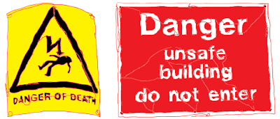
    DANGER OF DEATH | UNSAFE BUILDING


    Making the move from idea to actualised project was definitely easier when I was in education and had, seemingly, all the time in the world to focus on my art practice. Now that I am juggling jobs, real-life and my art practice the road from A to B takes much longer.

    I started The Road Sign Collection in September and it has developed. However, my biggest problem is that it is developing much faster in my mind than it is outwardly. I am stuck between wanting to get to an end point – for my practice this means something outward facing, and not to rush the process in case I miss something important in the developmental stages. (Not to mention also trying to find time to read around the subject to ensure that it is contextualised). My lack of time requires me to plan ahead and then realise ideas when I can find a slice of time to do so. Ideas will often start in my sketchbook and then go through a digital process where I try to figure out the site from afar. 


    This is why I ended up installing my latest site-specific text piece in the dark (and freezing cold). This installation, ‘DANGER OF DEATH | UNSAFE BUILDING’ utilises a site that I have used before. In a previous installation I looked to the site to inspire the language used within it.


    My reasons for wanting to revisit this site where two-fold; firstly, due to its crumbling aesthetic and its size, which allows me to play with aspects of teleperception (Virilio, 2010). This new installation had a slightly different approach to the first. This time I was looking to the found text from The Road Sign Collection and applying it to appropriately to the site in question, allowing the work and the site have a dialectical relationship (Owens, 1998).

    This approach allows me to re-position the text away from its original state/site/purpose and apply it directly onto the site in question. This allows the text to feel more directly related to the site, meaning that the chosen words start to come from the site, in this particular instance it is as if the building itself is warning the reader of its state. 


    My choice of vinyl was in keeping with my art practice, but mostly in this instance picked due to being able to fabricate the lettering ahead of time. Meaning that the installation is much quicker than for example working with tape on site. Using both black and white vinyl was intentional and intended to be used as something sort of experimental; which colouring would be most readable? Most jarring?  

    Reflecting on the choice of colouring of the vinyl I found that both brought something different to the installation; the white was easier to view, the black draws you in closer for clarify. Viewing the work in both day light and darkness only emphasised this further. This change in conditions is important to consider, given that the text is installed in a public place, which can be view at any time (Rose, 2013). The passing of time is key here, as the falling-down process has happened over time. 


    Revisiting the water tower allowed me to find a new way of working within the specific limitations and conditions of the site (O’Doherty, 1986). Having said that, the limitations and conditions of the site have changed slightly since I last used it in 2017. The building is disused and has continued to deteriorate in the last two years, making it less accessible and more of a hazard. It was unchoice territory two years ago and that has only increased over the years (O’Doherty, 1986, p.67). 

    Originally, I wanted to work with all for corners of the water tower. However, from a site visit I knew that this would be impossible as the access to two of the corners was now blocked by fallen debris. By using the corners, the audience are encouraged to move around the work, again touching on notions of teleperception (Virilio, 2010), as the work goes on farther than the eye can see. working with this placement also breaks the text, as it moves around the corner (Deleuze, 1997), echoing the breaking up of the site itself. 


    The materiality of the work and the intention that it will be temporary allows the text itself to start taking on the characteristics of the water tower; both are falling down. After one day of being installed some of the vinyl lettering had fallen from their place. While the water tower has existed for a much longer time period, it too is losing part – largely slates from the roof, hence the chosen warning signs. There is a rawness of ‘nowness’ (Hayward, 2004) as things are changing continually. 


    Going forward I plan to install these words into a new site, one which clashes which the original intention of the text. This will allow me to create something quite playful which encouraged a more lateral interpretation of the text.


    References


    Deleuze, G. (1997) Essays Critical and Clinical. University of Minnesota Press.

    Hayward, K. (2004) City Limits: Crime, Consumer Culture and the Urban Experience. Routledge Cavendish.

    O’Doherty, B. (1986) Inside the White Cube. University of California Press.

    Owens, C. (1998) The Allegorical Impulse: Towards a Theory of Postmodernism. New York: Oxford Press.

    Rose, G. (2013) Visual Methodologies. Sage Publications Ltd; 3 editions.

    Virilio, P. (2010) Art as Far as The Eye Can See. London: Bloomsbury.