Showing posts with label text art. Show all posts

Sunday, March 7, 2021

Unfamiliars: Tales for the Fireside 2

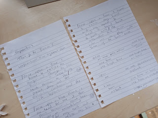
Putting together my contribution for the Unfamiliars: Tales for the Fireside 2 zine started by considering the title, the first thing that came to mind for me was the first line of many fairy tales, 'once upon a time'. The use of these phases would draw upon shared public language and resonate with others familiar with fairy tales. 

An image of a note book
Once upon a time...

From taking this initial start point I then explored how to expand this. I often work with automatic writing due to its nonsensical outcomes. I employed my smartphone here, to create digital automatic texts which followed on from the phases, 'once upon a time'. 

To create these outcomes I entered the phase and then selected the predicted text, this adds a personal element to the outcome as the phone draws on my most used language. I wanted to move away from these outcomes - mostly as it turns out I am not that exciting and the outcome was not as playful as I had hoped!

Digital Automatic Writing


The second exploration on the start phrase was to look at synonyms for the words, finding words that mean the same thing as each word component. This exploration is the one I decided to develop, it allowed me to start breaking the language and moving it away from the shared public language of the initial phase and move towards something more Dada. The change is slight but enough to distort the reading a little. 

Synonyms


Once each of the words in the phrase had been replaced I start to put them together using my ACcomplte4 plaster letters. The maternity of the final outcome is not particularly important, it is just the medium I am currently interested in working in.

Final Outcome

See the final copy in print, available to buy at Tales for the fireside // Hand Embellished Limited Magazine | Etsy 


Sunday, January 31, 2021

Some writing about my practice.

Some writing about my practice, with a focus on the automatic.

In short:

My practice explores the use of text/site. The work produced is usually temporary, drawing on notions of time and place, duration and mutability. This is echoed in the use of language, as that too is affected by these factors. Nothing is fixed and my practice focuses very much on nowness.

In Long:

My practice is heavily involved in the use of language and linguistics, I rely on the notion of a shared public language which can be accessed and interpreted in an infinite amount of ways by the reader. Art allows us to elevate the everyday, making people consider these things, such as language in new ways.

I have been using automatic writing for many years and find it a great way to kick start my creative process. The words that emerge are often nonsensical – something that I find refreshing in a world that depends on us being sensible. However, everyday themes tend appear too – bring the work back to reality and making it relatable to an audience. I have exhibited automatic writing in numerous ways and am always struck by how other people find their own connections in something that has been created in my world, highlighting our connections to others and the importance of community/communication. The connection between language and time also interest me as it is fleeting and ever-changing nature.

The intention of my practice is to engage the audience and creating a dialectical relationship between the art and the audience and the art the its surrounding. I work both digitally and with installations to achieve this. I have always considered the installation and the removal of my installations as performative. However, these are usually performances without an audience.

Examples:

2020


2019


2015


Sunday, December 27, 2020

A Four Lettered Word - Part Four

This project has ind of fallen away a little. This is as I always have more than one project on at any one time. However, I have played with digitally altering the image. This was an attempt to blur the text.

While this did work, I worry that it makes the text too unreadable - the central letters feel OK to me, but the outer letters are becoming lost.

I am note sure where I will go with this idea, or if it will just fade away into the night. 

I think that i is good to remember that not all projects and ideas will work out, that is just part of the creative journey. 

Sunday, March 29, 2020

Reflecting on the Firstsite Collectors Group Bursary Application Process

My application writing processes involves many editing stages. I will look at what the application is asking for specifically and in the first instance will just write. The first editing stage focuses on refining the information and ensuring that I have not gone off on a tangent. I will then look at the word count and edit accordingly, removing anything that is not directly relevant. As an artist I find that I apply for opportunities regularly and like to keep a word document with text about my art for future reference, as part of my art practice I also try to write about and contextualise my artwork which I also store digitally.

Past Experiences 

Completing the application also gave me room to reflect on relevant past experiences, as an artist who find public outcomes central to their practice, I found this activity insightful as I do tend to exhibit widely. However, I was able to pinpoint the experience which have been more beneficial to the development of my art practice and what it was each consisted of. Below are the five past experiences that I chose to include. I made the conscious decision to look back over all past experience, picking the most relevant, rather than the most recent ones. 

2019 Fold, Lewisham Project Space: For this exhibition I have created a set of paku-paku’s which contain randomised wording, these have been designed to allow audience members to pick up and play with these to create nonsensical text patterns.

2019 CAS at the Beecroft, The Beecroft: As part of this I exhibited a collection of plaster playing cubes – styled after children’s playing blocks, each with a letter etched into each side of each cube. These can then be interacted with by the audience to create their own text.

2019 Unfamilaiars: WONDER, The Minories: For this pop-up I installed a floor-based string installation. The installation was designed to be fleeting and by interacting with the artwork the audiences also start to destroy the installation.

2018 Art, War and Reconciliation, The Minories: In direct response to the theme of the exhibition I was able to reposition pre-existing war time text to the modern day. This allowed the audience to experience the text in a completely different context and to view how this changes the reading of the text.

2017 Float: Identity, Firstsite: Work for this exhibition was made up of screwed-up pieces of A4 paper, each with a drawing concealed inside relating to an aspect of my identity. These pieces were discarded onto the floor and could be interacted with the

Examples of Work

The application also asked for three example of work. I chose to include two images of previous work and one image which was the basis of my bursary proposal. I felt that the images I included visually summed up my art practice well and showed how it has developed. It is always at the point in application that you are reminded of the importance of ensuring that you document work effectively and with high quality images - especially if, like me your work is ephemeral.

it’s all over
2018. Wooden Board. 32x194x0.5cm. Installation View.


It’s All Over is part of a larger collection called The Initial Wooden Lettering Collection.

Works in this collection were made at the end of my MA Fine Art degree, which I completed at University of Suffolk, Graduating in 2018 with Distinction. The work is commenting on the context of the MA exhibition and the MA coming to its conclusion with the opening of the exhibition.

The text is direct and to the point. It is self-descriptive to the situation. While the text used is neutral, it can be read as negative or positive depending on the viewers outlook. The intention is to provide closure to the situation. However, by not expanding on what it is that is all over, the work is left open to be interpreted by the audience. There is an air of story-telling within the works, the notion of stories draws me in. What is the story behind the work or the meaning of the work? It’s All Over, the work says, but what is all over? Asks the audience.

The curation of the wooden letters is not fixed, they are easily moved and repositioned within the gallery space; this chose was made to ensure that the physicality of the work echoed that of the context of the work; relating to both the mutability and breakability of language.

These letters have been used subsequently in a Colchester Art Society Exhibition at The Minories. However, the lettering was used to create a new series of words, based upon the limitations of the few letters that I had previously created. Further playing on the notion of mutability of language. By reusing these letters, I felt that they were able to keep their authenticity and aura of being originals.

KEEP GOING
2018. Vinyl. 132x17cm. Installation View


Keep Going was created as a moment of personal reflection for Cairns, made public. It is open to interpretation and will resonate differently to each reader, with the meaning possibly changing on each viewing depending on personal mood. The only limitation to the number of interpretations of the work, is the number of people who view it.

Keep Going: Continue to move forward.

The repetitive nature of Keep Going is reaffirming the definition of the text and becomes mantra-like.

The Road Sign Collection
2019. Digital Drawings. Size Variable.


The Road Sign Collection started by chance after an art walk during an art tutor CPD day run by NEAAT (Network of East Anglian Art Teachers). As a group we were instructed to walk around the Fine City of Norwich and document the walk with; photos, drawings, rubbings. During this walk, I photographed road signs. I was drawn to these due to the nature of my art practice, which is concerned with the relationship between text and site. During this time, I was teaching a short course titled, ‘Exploring Drawing and Illustration’, with one of the weeks focusing on line drawing techniques - something that I am usually guilty of neglecting within my practice. However, covering this topic and seeing my learners’ outcomes – particularly their continuous line drawings, made me want to give it ago within my art practice. 

The intention is that each road sign drawing will be an original, with each only drawn once, in one continuous movement. The use of colour in the signs felt important to their ability to carry out their function successfully. I had to start to consider the readability of the sign and our temporal relationship with them. Without the colouring, there is a sense of unfamiliarity to them.

The more time that I spend with the road signs the more I start to consider placing them into a new context. The text is direct and to the point when it is within the original context. Within my practice, I look to have public-facing outcomes and these signs lend themselves to be repositioned into a new context, away from the road. I look to explore what this does to our relationship with these signs that we encounter every day once they are put into an art context. This starts with turning them into drawings and will perhaps end in a gallery context, allowing this new cultural framework to change the context of the road signs.

Artist Statement 

Within the proposal we also needed to provide a 200 word artist statement. As you will have seen in my previous blog post, my artist statement is lengthy, around 550. This process of condensing text makes you consider every aspect of what you do and what is most central to your artistic process.

This version conveys my artistic practice, but does lack the depth of my current artist statement.

My art practice explores the use of text and site. I often use found text within my work and will draw upon the texts original meaning to guide my practice. The use of our shared public language is essential to the works success.

Within my practice I create site specific installations and work with the concept of text/context to create works which resonate with the site. One of the aims of my art practice is to create situations in which dialectical relationships can take place between; the art and the audience/the art and the site.

My practice takes a DIY approach and I strive to use materials that are inexpensive and readily available; such as electrical tape and ready mixed paint and processes which are easily accessible. I feel that this also links into my interests surrounding things that are ‘everyday’ – such as my use of language.

My current research interests surround my dual role of artist and teacher and how these two roles inform each other. I would like to explore further the benefits of being an art tutor who also has an active art practice, both for myself and for my learners.

Sunday, January 5, 2020

Playing Cubes Revisited

Playing Cubes was one of my favourite things to come out of my art practice in 2019. The concept for this piece came about in March. The cubes started their lives as paper cubes and then fabric cubes before becoming the plaster cubes that I considered a finished piece.

The name of the piece came from the notion of games and playing, as influenced by Dadaism (and children’s playing cubes). The intention was also that the language used within the title would let the audience know that the work was intended to be interacted with.


My art practice takes a DIY approach, making use of materials which are often inexpensive (Vam, 2017) and using processes that are easily accessible (Benjamin, 2015). The process of making the cubes took a few weeks, as I work on a small scale and have a DIY ethos, the production is much slower than something that is mass produced. It was also important to me that the cubes where note simply re-produced (on a production line). By handcrafting each cube my multiples to retain the quality of being an original, this is important as it means that the aura of the original is not lost (Benjamin, 2015, p.70). each cube is an individual, with its own aesthetic. They are 'originals', which are multiples of sorts (Judovitz, 1998). As they are assembled of pre-existing gestures and conventions.

The process to create each plaster cube is as followed; each cube is set in a handmade 5x5x5cm paper cube, lined with petroleum jelly and then filled with hand mixed plaster. They are then left to dry. The process was a simple one, but effective. There was something quite ritualistic about it, as I followed the processes. The number of cubes created was not pre-set, each time I unwrapped the new cubes and added them to the existing pile of complete cubes I felt compelled to create more. The process only stopped once had submitted them to the Colchester Art Society Summer Exhibition, as at this point the work felt ‘done’. Had I not submitted the work for exhibition it is entirely possible I would still be making plaster cubes now.

The focus of my practice is the use of a shared public language, this resulted in the addition of the lettering to the playing cubes. Etching of the letters into the cubes was labour intensive and time consuming, with each hand carved into the set plaster, utilising my own font, ACcomplete4. The letter choice was random as did not have any preconceived ideas of a word or phrase. Instead wanting the audience to interacted with themplayed with them. The cubes play into notions of breaking up language (Deleuze, 1997), as they use linguistic units (Katamba and Kerswill, 2009), rather than pre-set text.  They also allow us to consider how we make sense of things (Peirce, 1931-58), the work allows the audience to make their own sense of language.

Due to the gallery context in which the Playing Cubes where exhibited in I am unsure how much playing went on with the cubes. Galleries are highly controlled spaces (O’Doherty, 1986), in which we usually just look at work.


I am now revisiting the cubes in conjunction with The Road Sign Collection. I have decided to revisit the cubes as there is something pleasing in their simplicity, I also want to explore the notion of play more as I go forward. Currently I have returned to the paper cubes, however I may experiment with other materials going forward. These cubes remain the same size as the originals, but going forward I want to explore increased scale, as the road signs used for inspiration are large.


Reference

Benjamin, W. (2015) Illuminations. London: Penguin.

Deleuze, G. (1997) Essays Critical and Clinical. University of Minnesota Press.

Judovitz, D. (1998) Unpacking Duchamp: Art in Transit. University of California Press. 

Katamba, F. and Kerswill, P. (2009) English Language: Description, Variation and Context. Palgrave; 2009 edition. 

O’Doherty, B. (1986) Inside the White Cube. University of California Press.

Peirce, C. S. (1931-58): Collected Writings (8 Vols.). Ed. Charles Hartshorne, Paul Weiss & Arthur W Burks. Cambridge, MA: Harvard University Press

Vam. (2017) Plywood: Material of the Modern World. [online] https://www.vam.ac.uk/exhibitions/plywood-material-of-the-modern-world. [accessed 02/01/20].

Sunday, December 1, 2019

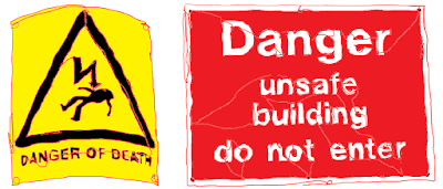
DANGER OF DEATH | UNSAFE BUILDING


Making the move from idea to actualised project was definitely easier when I was in education and had, seemingly, all the time in the world to focus on my art practice. Now that I am juggling jobs, real-life and my art practice the road from A to B takes much longer.

I started The Road Sign Collection in September and it has developed. However, my biggest problem is that it is developing much faster in my mind than it is outwardly. I am stuck between wanting to get to an end point – for my practice this means something outward facing, and not to rush the process in case I miss something important in the developmental stages. (Not to mention also trying to find time to read around the subject to ensure that it is contextualised). My lack of time requires me to plan ahead and then realise ideas when I can find a slice of time to do so. Ideas will often start in my sketchbook and then go through a digital process where I try to figure out the site from afar. 


This is why I ended up installing my latest site-specific text piece in the dark (and freezing cold). This installation, ‘DANGER OF DEATH | UNSAFE BUILDING’ utilises a site that I have used before. In a previous installation I looked to the site to inspire the language used within it.


My reasons for wanting to revisit this site where two-fold; firstly, due to its crumbling aesthetic and its size, which allows me to play with aspects of teleperception (Virilio, 2010). This new installation had a slightly different approach to the first. This time I was looking to the found text from The Road Sign Collection and applying it to appropriately to the site in question, allowing the work and the site have a dialectical relationship (Owens, 1998).

This approach allows me to re-position the text away from its original state/site/purpose and apply it directly onto the site in question. This allows the text to feel more directly related to the site, meaning that the chosen words start to come from the site, in this particular instance it is as if the building itself is warning the reader of its state. 


My choice of vinyl was in keeping with my art practice, but mostly in this instance picked due to being able to fabricate the lettering ahead of time. Meaning that the installation is much quicker than for example working with tape on site. Using both black and white vinyl was intentional and intended to be used as something sort of experimental; which colouring would be most readable? Most jarring?  

Reflecting on the choice of colouring of the vinyl I found that both brought something different to the installation; the white was easier to view, the black draws you in closer for clarify. Viewing the work in both day light and darkness only emphasised this further. This change in conditions is important to consider, given that the text is installed in a public place, which can be view at any time (Rose, 2013). The passing of time is key here, as the falling-down process has happened over time. 


Revisiting the water tower allowed me to find a new way of working within the specific limitations and conditions of the site (O’Doherty, 1986). Having said that, the limitations and conditions of the site have changed slightly since I last used it in 2017. The building is disused and has continued to deteriorate in the last two years, making it less accessible and more of a hazard. It was unchoice territory two years ago and that has only increased over the years (O’Doherty, 1986, p.67). 

Originally, I wanted to work with all for corners of the water tower. However, from a site visit I knew that this would be impossible as the access to two of the corners was now blocked by fallen debris. By using the corners, the audience are encouraged to move around the work, again touching on notions of teleperception (Virilio, 2010), as the work goes on farther than the eye can see. working with this placement also breaks the text, as it moves around the corner (Deleuze, 1997), echoing the breaking up of the site itself. 


The materiality of the work and the intention that it will be temporary allows the text itself to start taking on the characteristics of the water tower; both are falling down. After one day of being installed some of the vinyl lettering had fallen from their place. While the water tower has existed for a much longer time period, it too is losing part – largely slates from the roof, hence the chosen warning signs. There is a rawness of ‘nowness’ (Hayward, 2004) as things are changing continually. 


Going forward I plan to install these words into a new site, one which clashes which the original intention of the text. This will allow me to create something quite playful which encouraged a more lateral interpretation of the text.


References


Deleuze, G. (1997) Essays Critical and Clinical. University of Minnesota Press.

Hayward, K. (2004) City Limits: Crime, Consumer Culture and the Urban Experience. Routledge Cavendish.

O’Doherty, B. (1986) Inside the White Cube. University of California Press.

Owens, C. (1998) The Allegorical Impulse: Towards a Theory of Postmodernism. New York: Oxford Press.

Rose, G. (2013) Visual Methodologies. Sage Publications Ltd; 3 editions.

Virilio, P. (2010) Art as Far as The Eye Can See. London: Bloomsbury.


Wednesday, October 23, 2019

The Road Sign Collection

The Road Sign Collection started by chance after an art walk during an art tutor CPD day run by NEAAT (Network of East Anglian Art Teachers). As a group we were instructed to walk around the Fine City of Norwich and document the walk with; photos, drawings, rubbings. During this walk, I photographed road signs. I was drawn to these due to the nature of my art practice, which is concerned with the relationship between text and site.

The choice may have also been influenced by my interest in what Duchamp calls the ‘unchoice’ (O’Doherty, 1986), with so many things to look at in a fine city and I am choosing to focus my attention on road signs. They struck me as ready-mades in a site-specific installation, something chaotic, yet powerful in their ability to direct traffic (Ranciere, 2009).

However, despite my initially drawing my attention, once the day had come to an end I promptly forgot about the signs.


During this time, I was teaching a short course titled, ‘Exploring Drawing and Illustration’, keep your eyes peeled for a future blog post ‘Teaching Drawing’ for more on this, with one of the weeks focusing on line drawing techniques - something that I am usually guilty of neglecting within my practice. However, covering this topic and seeing my learners’ outcomes – particularly their continuous line drawings, made me want to give it ago within my art practice. 


Working with the long-forgotten road sign photographs, I drew mostly continuous line drawing of the photographs using a drawing tablet and digital pen. I found, as my learners had hours earlier that it is much easier to tell someone not to take the pen off the page than it is to not take your pen off the page. However, I found the continuous line drawing outcomes felt more natural and so persevered.
I felt that once the pen was lifted from the page the aura of that piece of work is set (Benjamin, 2015) and that those drawing which contained broken lines lost their authenticity. Having a break in the line looks too considered, shows a pause in the process and takes away from the overall aesthetic of the sign. 


The intention is that each road sign drawing will be an original (Benjamin, 2015), with each only drawn once, in one continuous movement. There is some irony in this conversation about originals, as the signs themselves are of course not original, rather they are multiples of something mass-produced and largely used. What it is that makes them original is the lived experiences the sign has had (Benjamin, 2015), reflected in the condition of each sign. The more these road signs have been interacted with, the more damage they will suffer (Dezeuze, 2007). This is something that I wanted to ensure that I captured within the drawings, to allow each sign to be recognisable as a copy of the original sign, drawing on Judovitz's notion of originals as multiples of sorts (1998). 

Initially, this activity did not have a purpose beyond flexing my continuous line drawing skills. However, as I created the drawings, I started to see the potential for a new project. I started to explore the use of block fill colour to make them more reminiscent of the originals. I was undecided on the outcomes and continued to keep a version in which they remain as continuous line drawings.

The use of colour in the signs felt important to their ability to carry out their function successfully. I had to start to consider the readability of the sign and our temporal relationship with them (Foster, 1996). Without the colouring, there is a sense of unfamiliarity to them (Deleuze and Guattairi, 1987).


The more time that I spend with the road signs the more I start to consider placing them into a new context (Grosenick, 2002). The text is direct and to the point when it is within the original context.

Within my practice, I look to have public-facing outcomes and these signs lend themselves to be repositioned into a new context, away from the road. I look to explore what this does to our relationship with these signs that we encounter every day once they are put into an art context. This starts with turning them into drawings and will perhaps end in a gallery context, allowing this new cultural framework to change the context of the road signs (Kwon, 2002).


Reference

Benjamin, W. (2015) Illuminations. London: Penguin.

Deleuze, G.  and Guattairi, F. (1987) A Thousand Plateaus: Capitalism and Schizophrenia. University of Minnesota Press.

Dezeuze, A. (2007) Tate Papers no.8: Blurring the Boundaries between Art and Life (in the Museum?). [online] http://www.tate.org.uk/research/publications/tate-papers/08/blurringboundaries-between-art-and-life-in-the-museum. [accessed 23/10/19].

Grosenick, U. (2002) Art Now. Taschen GmbH; 01 edition.

Judovitz, D. (1998) Unpacking Duchamp: Art in Transit. University of California Press

Kwon, M. (2002) One Place After Another: Site Specific Art and Locational Identity. The MIT Press: Cambridge Massachusetts and London, England.

Ranciere, J. (2009) The Future of the Image. London: Verso.

Tuesday, October 22, 2019

Welcome


In this blog I will be exploring both my art practice and teaching philosophy, with a view to examine how the two co-exist.

A synopsis of my art practice:

My art practice explores the use of text and site. I often use found text within my work and will draw upon the texts original meaning to guide my practice. The use of our shared public language is essential to the works success.

Within my practice I create site specific installations and work with the concept of text/context to create works which resonate with the site. One of the aims of my art practice is to create situations in which dialectical relationships can take place between; the art and the audience/the art and the site.

My practice take a DIY approach and I strive to use materials that are inexpensive; such as electrical tape and ready mixed paint and processes which are easily accessible.


My teaching background:

I am currently teaching unaccredited art courses within an Adult Community Learning setting. Within this role I plan and deliver short art courses, the themes of these include, ‘Exploring Drawing and Illustration’.

As well as this I work part-time as a Study Skills and PASS (peer assisted student success) Adviser in a Higher Educational setting. Within this role I plan and deliver sessions, conduct 1-2-1 tutorials and facilitate PASS Leader Training. Sessions range from presentation skills to leaflet design.

I am also currently running a Creative Practitioner Support Programme at SPACE Colchester, 37 Queen Street. Each month will see two artist feedback sessions open to all creatives; whether they are still studying, graduated, emerging or re-emerging. Offering opportunities for peer-to-peer feedback on work-in-progress.

Previously I have worked within an FE setting teaching Art and Design.