Making the move from idea to actualised project was definitely
easier when I was in education and had, seemingly, all the time in the world to
focus on my art practice. Now that I am juggling jobs, real-life and my art
practice the road from A to B takes much longer.
I started The Road Sign Collection in September and it has
developed. However, my biggest problem is that it is developing much faster in
my mind than it is outwardly. I am stuck between wanting to get to an end point
– for my practice this means something outward facing, and not to rush the
process in case I miss something important in the developmental stages. (Not to
mention also trying to find time to read around the subject to ensure that it
is contextualised). My lack of time requires me to plan ahead and then realise ideas
when I can find a slice of time to do so. Ideas will often start in my sketchbook and then go through a digital process where I try to figure out the site from afar.
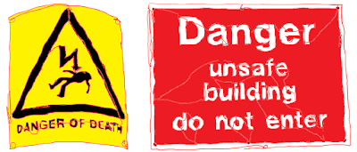
This is why I ended up installing my latest site-specific text piece in the dark (and freezing cold). This installation, ‘DANGER OF DEATH | UNSAFE BUILDING’ utilises a site that I have used before. In a previous installation I looked to the site to inspire the language used within it.
My reasons for wanting to revisit this site where two-fold;
firstly, due to its crumbling aesthetic and its size, which allows me to play
with aspects
of teleperception (Virilio, 2010). This new installation
had a slightly different approach to the first. This time I was looking to the found
text from The Road Sign Collection and applying it to appropriately to the site
in question, allowing the work and the site have a dialectical
relationship (Owens, 1998).
This approach allows me to re-position the text away from its original
state/site/purpose and apply it directly onto the site in question. This allows
the text to feel more directly related to the site, meaning that the chosen words
start to come from the site, in this particular instance it is as if the building
itself is warning the reader of its state.
My choice of vinyl was in keeping with my art practice, but
mostly in this instance picked due to being able to fabricate the lettering
ahead of time. Meaning that the installation is much quicker than for example working
with tape on site. Using both black and white vinyl was intentional and
intended to be used as something sort of experimental; which colouring would be
most readable? Most jarring?
Reflecting on the choice of colouring of the vinyl I found that both
brought something different to the installation; the white was easier to view,
the black draws you in closer for clarify. Viewing the work in both day light
and darkness only emphasised this further. This change in conditions is important to consider, given that the text is installed in a public place, which can be view at any time (Rose, 2013). The passing of time is key here, as
the falling-down process has happened over time.
Revisiting the water tower allowed
me to find a new way of working within the specific limitations and conditions of
the site (O’Doherty, 1986). Having said that, the limitations and conditions of
the site have changed slightly since I last used it in 2017. The building is
disused and has continued to deteriorate in the last two years, making it less accessible
and more of a hazard. It was unchoice territory two years ago and that has only
increased over the years (O’Doherty, 1986, p.67).
Originally, I wanted to work
with all for corners of the water tower. However, from a site visit I knew that
this would be impossible as the access to two of the corners was now blocked by
fallen debris. By using the corners, the audience are encouraged to move around
the work, again touching on notions of teleperception (Virilio, 2010), as the
work goes on farther than the eye can see. working with this placement also breaks the text, as it moves around the corner
(Deleuze, 1997), echoing the breaking up of the site itself.
The materiality of the work and the intention that it will be temporary
allows the text itself to start taking on the characteristics of the water
tower; both are falling down. After one day of being installed some of the
vinyl lettering had fallen from their place. While the water tower has existed
for a much longer time period, it too is losing part – largely slates from the
roof, hence the chosen warning signs. There is a rawness of ‘nowness’ (Hayward, 2004)
as things are changing continually.
Going forward I plan to install these words into a new site, one
which clashes which the original intention of the text. This will allow me to
create something quite playful which encouraged a more lateral interpretation
of the text.
References
Deleuze, G. (1997) Essays
Critical and Clinical. University of Minnesota Press.
Hayward,
K. (2004) City Limits: Crime, Consumer
Culture and the Urban Experience. Routledge Cavendish.
O’Doherty,
B. (1986) Inside the White Cube.
University of California Press.
Owens,
C. (1998) The Allegorical Impulse:
Towards a Theory of Postmodernism. New York: Oxford Press.
Rose, G. (2013) Visual
Methodologies. Sage Publications Ltd; 3 editions.
Virilio,
P. (2010) Art as Far as The Eye Can See.
London: Bloomsbury.


No comments:
Post a Comment