Sunday, March 27, 2022

Jessica Part 3

I have left the spoken story for a moment. I wanted to consider the drawings a little more and the addition of basic colour. 


It was important that the colour remain simple, but I wanted to give the composite character Jessica a unique feel, so that once other composite characters are written about they can have their own visuals and make the characters distinctive from each other.

Other colours are drawn from my research, such as the use of purple when referring to the artist-teacher,


One of the main challenges is representing some parts of the story visually. How you distinguish from childhood to adulthood. In this instance the child Jessica has pigtails and the adult has their hair dwon - but importantly, they wear the same colours, have the same hair colour. 


Sunday, March 20, 2022

Off the wall - Part Two

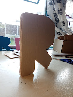
Development of block card letters. Layered card, joined with double-sided tape. Lightweight. Around A5-ish in size.

In keeping with my DIY art practice, these are made from recycled cardboard, hand-cut using a paper stencil, and assembled by eye. The end result is imperfect, each layer of the letter does not match up exactly. Reflecting the human element to the work.


The width of the letters has resulted in something freestanding - a possibility not considered in the planning stage. Will all letters stand?

These will be developed to be thicker, to make them robust and give them a feeling of being solid. 

Sunday, March 13, 2022

Jessica Part 2

Adding another element...

When developing the line drawing I wanted to consider how to retain some control over them. In that, I did not want them to veer into being something that took over. I wanted them to be quick, fast, and free.

To that end, I thought I would try to draw the images for the text as I was speaking the text. So that the drawings only took as long to draw as the story took to tell.


This proved to be difficult, as it transpires that reading, speaking, and drawing at the same time is quite difficult. I found myself pausing to draw and thus the drawing took longer than the telling of the story. 

The next idea is to record the story and then listen back to the story while drawing. However, as an endpoint I am considering a video of storytelling and story drawing. 

Sunday, March 6, 2022

Off the wall - Part One

 Developmental ideas for text which is 'off the wall'. Text that can sit on a wall, or floor, but away from them. Turning the 2D letter into a 3D sculpture. 


Ideas include block letters out of card, or hollow letters made from letter nets (think cube nets, but letters). Letters should be lightweight and movable, but stable enough not to break down when handled.

Placement of text to be experimental. push how words are read. in what order the letters need to be in for them to still make sense to an audience.

What scale should these be? Are they to view from one vantage point, or are they to be walked around?

Sunday, February 27, 2022

Jessica Part 1

As part of my research into artist-teacher in ACL I have put together stories based on a number of artist-teachers and used a composite character to tell their collective story. 

Initially, these stories existed just as written text, but I have considered the addition of images to help tell the story. To see if this enhances them.


My art practice does not usually involve drawing, however, line drawing has a place in my work occasionally. I didn't want anything too fancy or finished. I wanted the aesthetic to retain a DIY feel.

They are more sketches, a form of visual language than an artistic outcome. The art is about the combination of the two. The hand writing, the line drawings. The simplicity. 

Sunday, February 20, 2022

TIME

Time has emerged as a key theme in my research into artist-teachers in ACL. My art practice usually employs the use of single words that are open to interpretations. Time fits this criterion.


TIME is a stand-alone outcome made from cardboard - this might be covered in modroc at some point. The text is intentionally oversized and intended to be overtly present in a space. The outcome would be wall-mounted, rather than on the floor for easy viewing.


I am currently unsure on colouring of the work, or if the modroc will happen. I want the work to be simple. would adding colour and modroc over complicate it. What would the rationale be?

Sunday, February 13, 2022

Tiny Vinyl Letters - Part Four

Framed quotes by two artist-teachers with differing identities.


This may well be the first time frames have appeared in my art practice. I enjoyed taking something traditional and changing its use slightly.