09/02/20
Test One
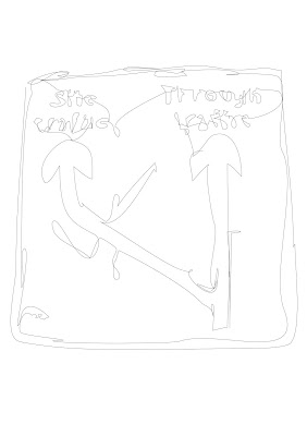
Before I could get started properly I had to face a few learning curves. I needed to get use to and becomes one with the feel of the digital pen, to ensure that I would be able to follow the lines of the road signs accurately. I found that the pen was very sensitive and that I needed to keep direct contact with the drawing tablet at all time. This should have been easy, given that I am working with continuous line drawing, however I am sure at times I had remained contact but the line still became broken.
While my usual methodology is to do something and then be done with it, I felt that I needed to afford myself some practice with the road signs before officially starting the process. This, it turns out was a good idea as I am still getting to grips with the new software I was not convinced by the practice outcome. Looking at the produced line drawing it feels rather weak, in colour and in line. The text is also not completely legible, which is an issue as the text is such a huge part of the signs integral meaning and purpose.
11/02/20
Test Three
Another practice, but improvement made. The text is more readable and the lines more certain of themselves. As I am still sceptical about the colouring of the lines I have explored different options.
Sign One: Point 1
Sign Two: Point 5
Sign Three: Point 7.5
I will disregard Point 1 as it is not visually strong enough. My initial reaction is Point 7.5, however I worry that goes the other way and is too strong. There is a need for the line to be bold and clear
Test Four
A timely reminded to not get over confident, broken lines.
Test Five
I need to be more careful when completing the text part of the sign. This sign will be re-done. I am torn as I want the signed to be clearly hand rendered, however I also want them to be read-able.
Completed: 3/71
12/02/20
Test Six
Landscape v's Portrait: Debating which orientation is best in relation to which allows for the largest outcome.
In this instance landscape works best, my worry going forward this that this might not be a trend. For my end goal I feel that they all need to exist in the same format and so it may just be a case of picking one and sticking with it.
Development
The decisions made so far:
- Line thickness: 7.5
- Page orientation: Landscape
To accommodate the landscape orientation I have made the decision to crop out any legs and poles attached to the signage (see text five for original image comparison), to allow the focus to be completely on the sign itself. This also allows for the image of the sign to take up more of the page.
Completed: 5/71
13/02/20
Development
It is taking a while to get back into the swing of drawing these things. On reflection I think that I am holding the digital pen incorrectly, too harshly and putting too much force into the movements. I need to loosen up, follow my own advice that I give when teaching drawing, and use my whole arm to follow the lines.
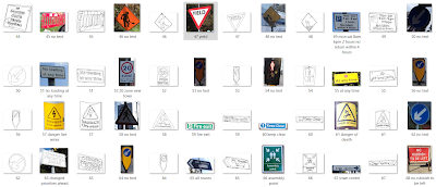
Some just do not look right. I want to resist the urge to re-do the ones I feel look wrong, as with continuous line drawing they are going to look imperfect. They tend to look worse in isolation, than when viewed with the rest of the collection,
Completed: 15/71
16/02/20
Development
I find that when I revisit the signs that I did not initially take to, I can then see them in a new light and accept them for what they are.
However, this hindsight does not extend to new works and I still find that I am having these initial disappointed feelings towards some new signs.
Completed: 22/71


No comments:
Post a Comment