Sunday, April 24, 2022

Magnetic paper letters Part One

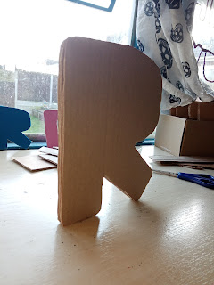
My work is often temporary, I am constantly looking for ways to install work that will not damage the location it is installed in.

I have landed on magnets. As long as I have a magnetic surface, these letters are good to go.


I am currently trying to work out the right kind of magnet. What shape and size? But more importantly, how strong.

My letters are lightweight - the letter nets are particularly lightweight as they are hollow. However, the cardboard letters are becoming dense. 

The video above shows attempt one. There will be many more attempts that follow, testing other materials and the strength of the magents and their staying power.


Sunday, April 17, 2022

Art Practice 2013-2022

 One year, one image. From 2013 to 2022.


Magnetic Part Two

Continuing the magnetic experiments, moving onto heavier cardboard letters and magnets. 


I prefer the look of these letters, they are easier to create and more stable. However, their weight is problematic. More magnets are needed. And even with two, the letter struggles to stay put. It will stay for a bit, but then gives up and falls to the floor. 


The letter also did not sit flush against the wall, as hoped. I think more magnets, placed evenly around the letter would help.

I had thought that magnets would be a quick-fix idea. It turns out there is much to consider here! I think the main issue is the strength of the magnets. While this is easily fixed by ordering stronger magnets, I do not want this to become an expensive endivour. As that would not be fitting with my part practice, which often uses cheap, easily available materials. 


Sunday, April 10, 2022

Letter Nets - Part One

I have been thinking about letter nets since my art foundation in 2012/3. I have never been able to work them out. Where the sides need to go, where the tabs need to go.

However, ten years on and I think I have finally started to figure it out. 


The letter nets will allow me to create super lightweight 3D letters. While I currently have no plans for them, sitting down and figuring it out is a win in itself.


They have the ability to be free-standing, moved around, and played with. They are in keeping with my DIY approach and at this small scale, I think they are quite endearing. They are intimidating in nature.

I found that due to the complex shape of letters that the paper did not allow for all sides to be covered. This was unplanned but the resulting aesthetic is intriguing, to be able to look inside a letter. Something I've not considered before.

Sunday, April 3, 2022

Off the wall - Part Three

While I love the cardboard, I wanted to elevate the letters and draw on traditional notions of text (ink as black). The front, back, and sides of each letter have been painted with back acrylic. 

The letters are now five layers thick. They are still lightweight but feel more solid as objects. 


This uniforms the letters a little more. They exist as something in between art objects and linguistic units. They have become bolder and harder to miss.

The intention is that they would be displayed in a white gallery space - black text on a white background. 

Currently, they are just painted, I am considering if they should be varnished - or if that would be a step too far. I don't want them to become too 'finished'.


Sunday, March 27, 2022

Jessica Part 3

I have left the spoken story for a moment. I wanted to consider the drawings a little more and the addition of basic colour. 


It was important that the colour remain simple, but I wanted to give the composite character Jessica a unique feel, so that once other composite characters are written about they can have their own visuals and make the characters distinctive from each other.

Other colours are drawn from my research, such as the use of purple when referring to the artist-teacher,


One of the main challenges is representing some parts of the story visually. How you distinguish from childhood to adulthood. In this instance the child Jessica has pigtails and the adult has their hair dwon - but importantly, they wear the same colours, have the same hair colour. 


Sunday, March 20, 2022

Off the wall - Part Two

Development of block card letters. Layered card, joined with double-sided tape. Lightweight. Around A5-ish in size.

In keeping with my DIY art practice, these are made from recycled cardboard, hand-cut using a paper stencil, and assembled by eye. The end result is imperfect, each layer of the letter does not match up exactly. Reflecting the human element to the work.


The width of the letters has resulted in something freestanding - a possibility not considered in the planning stage. Will all letters stand?

These will be developed to be thicker, to make them robust and give them a feeling of being solid.