Sunday, July 24, 2022

A different kind of FINE - part two - CAS Online Summer Exhibition

 The CAS online summer exhibition is still available to view: Online Exhibition | Colchester Art Society


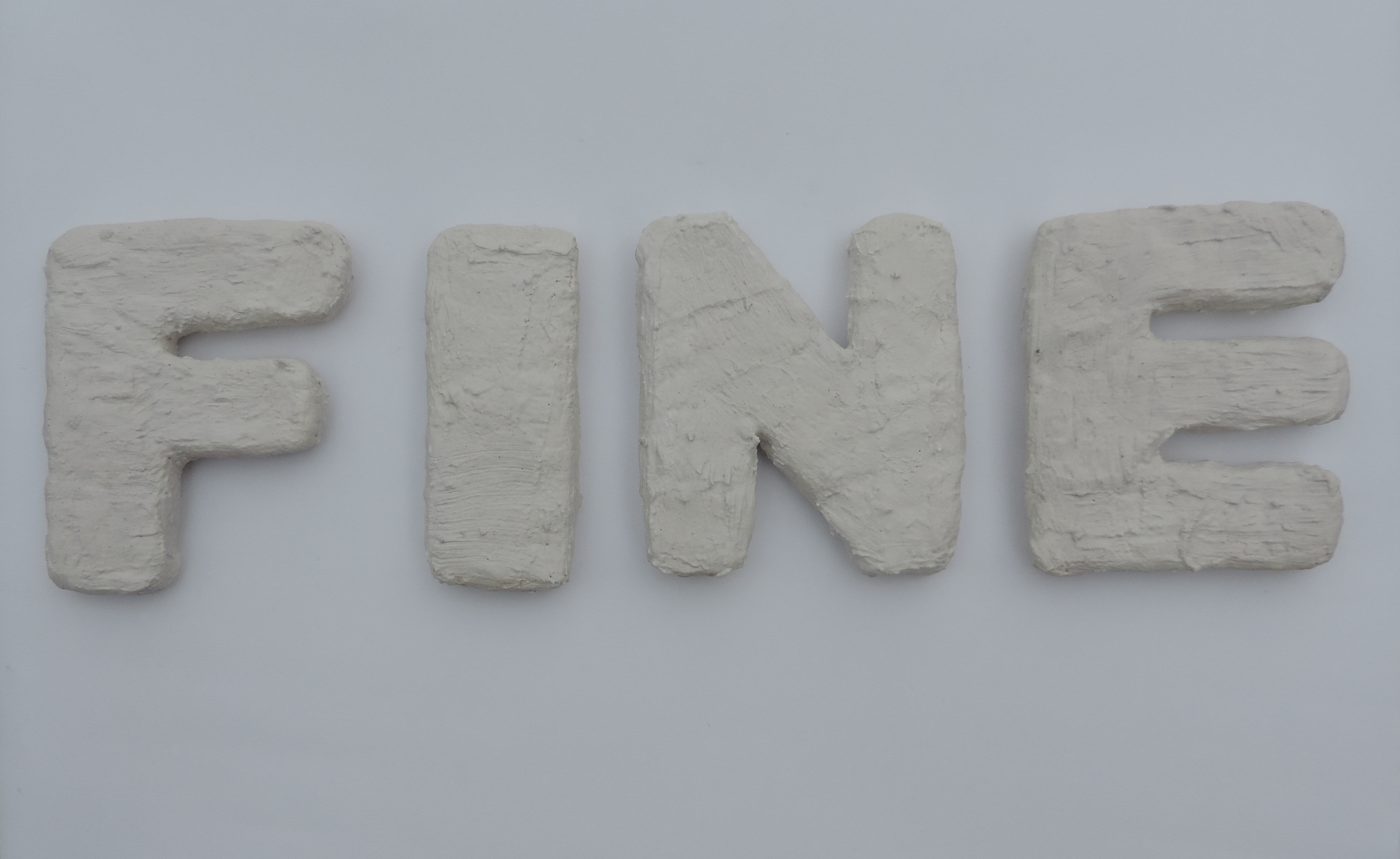
To add a sense of weight to the letters I wanted to disguise the modroc, by covering the letters in a thin coat of plaster. This hid the tell-tale modroc texture and gave an overall new texture. The intention is that they look like they might be solid plaster letters - rather than cardboard!


The difference is clear to see and I am looking forward to developing this technique further in larger-scale outcomes. I am yet to see how stable this top coat of plaster is. I do not want it to crack or reveal the modroc underneither. To try and avoid this, the plaster coat was added to the still wet modroc. 


It became a rather relaxing process. Initially I thought that I would perhaps dip or use my hands the add the plaster. But found that a small brush and small amounts of plater worked best. This allowed me to just add the plaster where the texture of the modroc was visible - keeping the letter nice and light!


The end outcome


Sunday, July 17, 2022

to the sea - A journey - Part Two

We left off last time waiting for some air-dry clay to dry. Once dry I considered where to go with it next. The letters both 3D and 2D did not feel like finished outcomes, but more like tools, I might use to create something. The context of the words drew me towards the use of cyanotypes.

My logic was very much thinking 'sea' and then thinking 'sun'. 


Cyanotypes in progress!


The first attempt did not go so well! The paper was over-exposed to the sun and the lettering started to fade.


Sunday, July 10, 2022

A different kind of FINE - part one - CAS Online Summer Exhibition

For the Colchester Art Society online summer exhibition I wanted to create something that would develop on from the work I had in Borders #2: Abbie Cairns : Borders Exhibition - Ipswich Art Gallery (abbiecairnsartistandeducator.blogspot.com)

Stepping once again away from the colours and back to white. The font and font size remain the same, but the word material differs.

FINE the title of this self-named outcome was also inspired by another recent piece of art work showed at the University of Suffolk Abbie Cairns : University of Suffolk - Mental Health Awareness Week Exhibition (abbiecairnsartistandeducator.blogspot.com)


This text outcome brings together these two previous outcomes. From Borders, it borrows the layered card to create a 3D sculptural letter and from the UoS show, it borrows the keyword 'fine'.

FINE here develop onwards by bringing into the mix modroc. I wanted to create letters that looked heavy but were actually lightweight (always helpful if you are the one having to carry these things around!).


See the CAS online exhibition here: Online Exhibition | Colchester Art Society


Sunday, July 3, 2022

to the sea - A journey - Part One

My text-based artwork often draws on language that has come to me automatically, however, sometimes I use found text. The words 'to the sea' come to in this way. I'm sure the words come from many places but for me, they come from a Razorlight song. They are three words that always get stuck in my head after hearing it place. I wanted to do something with them, in the hope that they would stop going around in my head, on repeat. 

Tiny Letters: Positive Space v's Negative Space

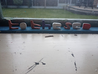
The first stop was to play with pre-existing materials, tiny letters made from both air dry clay and plaster. I enjoyed playing around with these and picking which letters from my large collection to use. I went for the ones that would stand up on their own. 


This then inspired some more air dry clay work, this time wanting to capture the negative space. I used my font stencil and a craft knife to cut out the letters and then left them to dry.


Sunday, June 26, 2022

TIME - cardboard and vinyl

Time has emerged as a key theme within my Ph.D. research, you can read more about my Ph.D. research here: Abbie Cairns - Norwich University of the Arts (nua.ac.uk)

Due to this the word has seeped into my art practice. Time felt large and logic dictated that I made it - literally -  large, to show its importance and unwieldiness. 

The work uses cardboard and vinyl to create large-scale letters in my usual, ACcomplete4 font (the typeface I use within all of my text-based artwork). I wanted to use a martial that was lightweight and easily moved, but I also wanted to draw upon the traditional text by having the letters black. The thought is that these could then sit against a white gallery wall and has a visual similar to biro on paper or typed text on a word document. 


I am not sure where time will go, but it now exists. 

Sunday, June 19, 2022

University of Suffolk - Mental Health Awareness Week Exhibition

I recently blogged about the development of 'I'm fine', a three-piece text art-based artwork. This work was created for the University of Suffolk - Mental Health Awareness Week Exhibition, which took place the week of 09/05/22. 


Exhibition Documentation

Photo Credit: Hannah Aria

The wall-based installation of this work adds to its context. The work feels small, surrounded by white wall, it draws on the feeling of being 'fine'. 


Sunday, June 12, 2022

fine - part four

This text-based tryptic comments on the phrase 'I'm fine' and what it really means. Often used as a response to the question of how are you, what does it mean to be 'fine'? The work offers two meanings, the first, is neat, and the second is more chaotic. It is down to the reader to decide which is most fitting.


The worn wood feels appropriate and echos the sentiment of 'fine', it could be better but it works. It suggests a history that we are not privy to.